The Psychology of the 3-Second Scroll: How Micro-Hierarchy and Negative Space Control Human Behavior
Open Instagram, LinkedIn, or any ecommerce storefront right now and scroll for ten seconds. Why does your thumb naturally halt at one specific visual while effortlessly gliding past dozens of others? It’s almost never because someone used a shinier gradient or paid for expensive 3D animations. It’s because the human brain is an energy-conservation machine. When visual information is cluttered, the brain experiences micro-friction and skips. When design respects cognitive hierarchy, action feels effortless.
Core Principles Explored:
- The Rule of One: Why competing visual focal points destroy conversion rates.
- Negative Space as Value: How whitespace signals authority, premium pricing, and confidence.
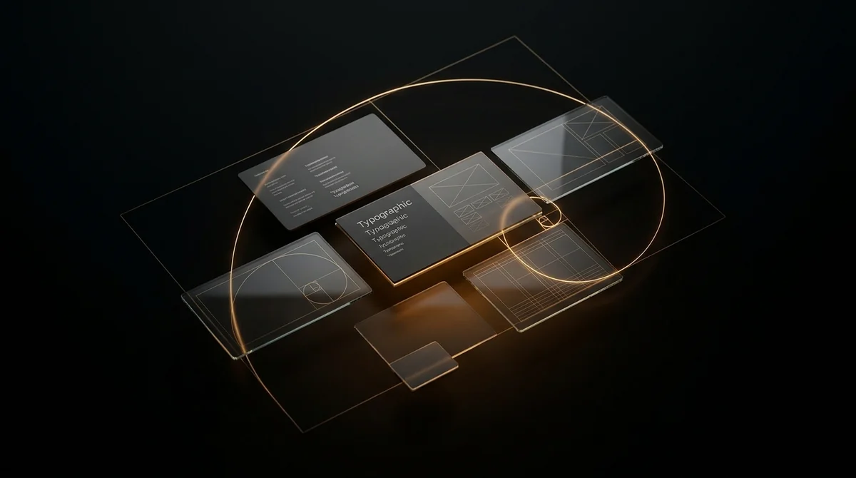
- Typographic Rhythm: The mathematical relationship between scale, line-height, and scanning velocity.
- Human Intuition vs. AI Clutter: Why intentional constraint beats unlimited generated complexity.
1. The Cognitive Load Problem on Modern Screens
Every element you place on a canvas—whether it’s a social post, a brand packaging label, or a landing page—demands a microscopic unit of mental processing power from your viewer.
Amateur design tries to say everything at once: three different badges, two clashing fonts, four bright colors, and bullet points crammed edge-to-edge. The designer thinks: "More information equals more value!" But to the human brain, that visual looks like white noise. The subconscious reaction is instantaneous: abort, keep scrolling.
Masterful graphic design is not about what you can cram into the frame; it is the deliberate discipline of subtracting everything that does not amplify the primary message.
2. Micro-Hierarchy: The Hidden Choreography of the Eye
When a prospect encounters your visual, their eyes do not wander at random. They follow an instinctual visual priority list determined by three fundamental physical variables:
- Scale (Size Differential): The primary anchor must be unequivocally larger than anything else. If your headline and secondary subtext are within 20% of the same font size, the eye hesitates. A bold 2.5x to 3x scale differential gives the brain an instant starting point.
- Value Contrast (Light vs. Dark): High contrast commands attention first. A deep space-black canvas paired with pure `#ffffff` text commands the eye far faster than low-contrast gray-on-gray styling.
- Spatial Isolation (The Cushion of Space): Placing an element inside generous padding elevates its psychological weight. Notice how luxury watchmakers or Apple position their products: a lone titanium casing floating in deep black space. The emptiness around the object communicates its worth.
3. Why Negative Space Is Not "Empty Space"
In my client consultations, founders often ask: "Adil, there’s a lot of empty black space here—can we add our phone number, a 5-star badge, and an award logo in the corner?"
My answer is always a polite but firm: No.
Negative space is not empty space—it is active design space. It is the silence between musical notes that makes the melody beautiful. When you crowd a visual, you immediately lower the perceived price of your service. Notice that discount dollar stores pack shelves to the ceiling, while luxury boutique fashion houses place a single coat on a marble stand with 10 feet of clear air around it.
Negative space is how your design silently says: "We are confident enough in the quality of what we offer that we don’t need to shout."
4. The Human Advantage in the Age of Generative AI
Today, anybody with an internet connection can prompt an AI model to spit out 500 hyper-detailed illustrations in thirty seconds. But you will notice something fascinating about 95% of AI-generated graphics: they feel soulless, busy, and forgettable.
Why? Because AI generates based on statistical average. It adds detail for the sake of detail. What AI cannot do is understand intent. It doesn’t know when a headline needs to be whisper-quiet, or when a color should be intentionally restrained to make one single purchase trigger explode off the screen.
That discernment—the restraint, the empathy for how a tired human scrolls their feed at 10 PM—is the pure domain of human design craft.